design ux It’s not just what it looks like and feels like. Design is how it works. - Steve Jobs
Developers have a responsibility to create meaningful products for their end users and that often requires strong empathy for the users. User personas, journey maps, sketches, and wireframes are tools that not only aid design concerns but also developers. They are also tools to involve both client and product teams to brainstorm and contribute to development.

User Personas
Not much time should be devoted in making user personas presentation-ready as scrappier options with sticky notes and greater visibility go a long way as developers, product managers, and business analysts learn more about their users. User personas can describe a users’ interaction with the product but should more importantly highlight their personal attributes that could affect their interactions. For example, a 10-15 year old may have more time to be online but what daily stressors or lifestyle do they lead in contrast to another type of user. When developing products, I like to first handle the average user but even within an age group or “average” grouping, there are differences and user personas are a great tool to remember users who may not constantly use or debug the app like developers.
Tools: Sketch app (free trial available), Balsamiq (free trial available), Google Docs and or Draw (free), Photoshop or Illustrator (free trial available)
A lot of these tools can also be used for user flows, user journeys, and wireframing.

User Flows and User Journeys
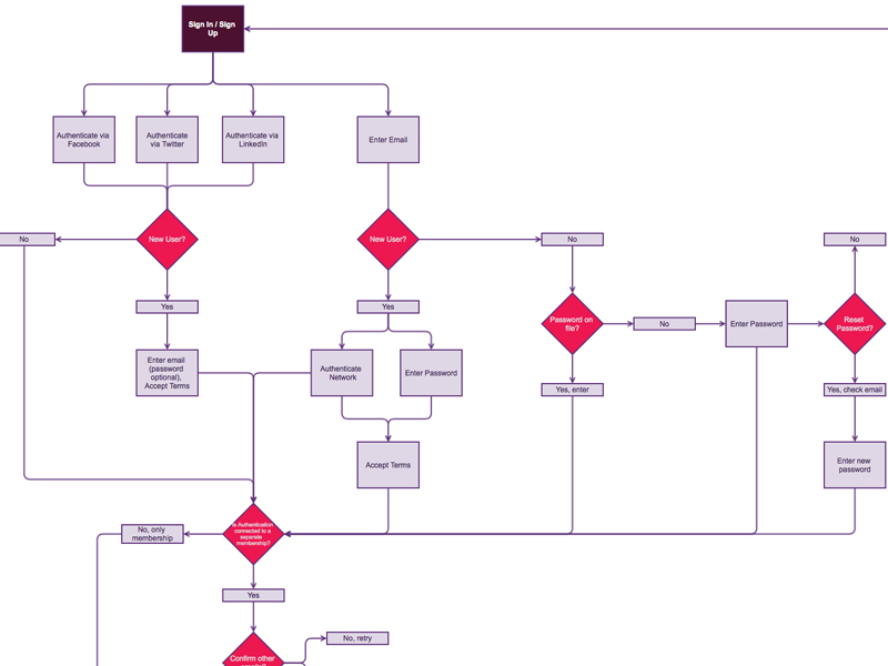
Text-based or visual, user flows describe the various paths and blocks when interacting with an app. While there is no consensus on the shapes and their meanings, the point of a user flow is to show possible decisions and consequences. I tend to start with a “happy” user flow where no blocks or errors occur end-to-end. This happy flow tends to focus on the Minimum Viable Product then and there. Additionally, user flows can describe the feel of an app from having too many site clicks for too little value or having blocked flows where the user cannot get easily restart the process.
 Less experienced with user journeys, I think they provide more emotional awareness of what the user could like or dislike. They also complement user personas by highlighting users’ stressors, pain points, and values.

Sketches
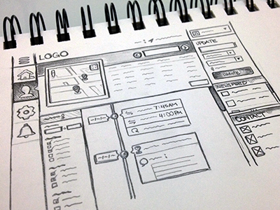
When I sketch my single page apps, I really focus on what I need for different actions: signing up, logging in, and viewing other actions. Sketches do not need to be perfectly executed but should bring problem solving and design to the forefront. I am not thinking about how I will implement the backend of an action but about the feel of that action. Where can instructions and errors be displayed prominently? Does this action have a modern look and not feel like it’s going to take a long time? Those are a few questions that come to mind when putting pencil to paper.

Wireframes
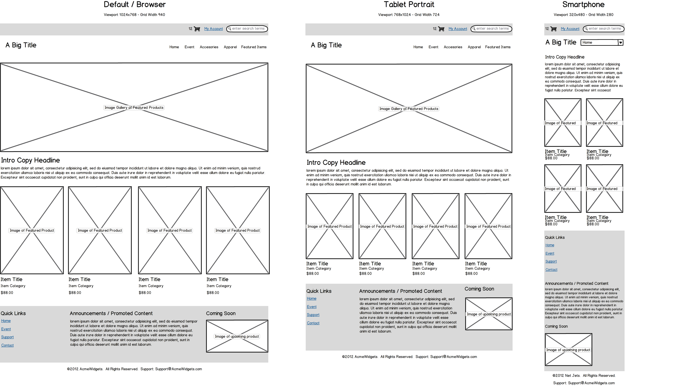
I love using Balsamiq for wireframing! Similar to sketching, wireframing gives product teams a visual example of an app. When sketching, I tend to have a harder time visualizing all of the potential images or objects rendered on a page. However, wireframing provides a more realistic shell of a final product. After going through user personas, flows, journeys, and sketches, wireframes is an ongoing product based of user research and design. These conversations should always be happening as different versions of an app are deployed.